Hello! I'm Brian.
I'm a product, UX/UI, and visual designer.
This site was hand-coded by yours truly.

  • Finvo website mockup on iPhone

    Finvo

    UX/UI & Visual design

    Overview

    Over the course of several months I was the sole UX designer designing a website for a community focused on promoting financial literacy. I reported to the two Founders.

    Finvo website prototype on a mobile device

    Challenge

    With a Discord community already in place, Finvo needed a website that would funnel users to the server as well as introduce and tell a bit about the community to new members.

    Foundational research

    The discovery phase included discussing with the Founders about the websites objectives and a competitive analysis of similar and adjacent community sites.

    Top website objectives

    1. Discord
    2. About (Finvo's story)
    3. Events
    4. Instagram
    5. Sign up email to mailing list
    6. Community features

    Key insights from competitive analysis

    1. No other female-focused Discord community
    2. Many of the color palettes we saw were pastels or had pink
    3. Showing bullet points of what communities offer seemed like a good idea
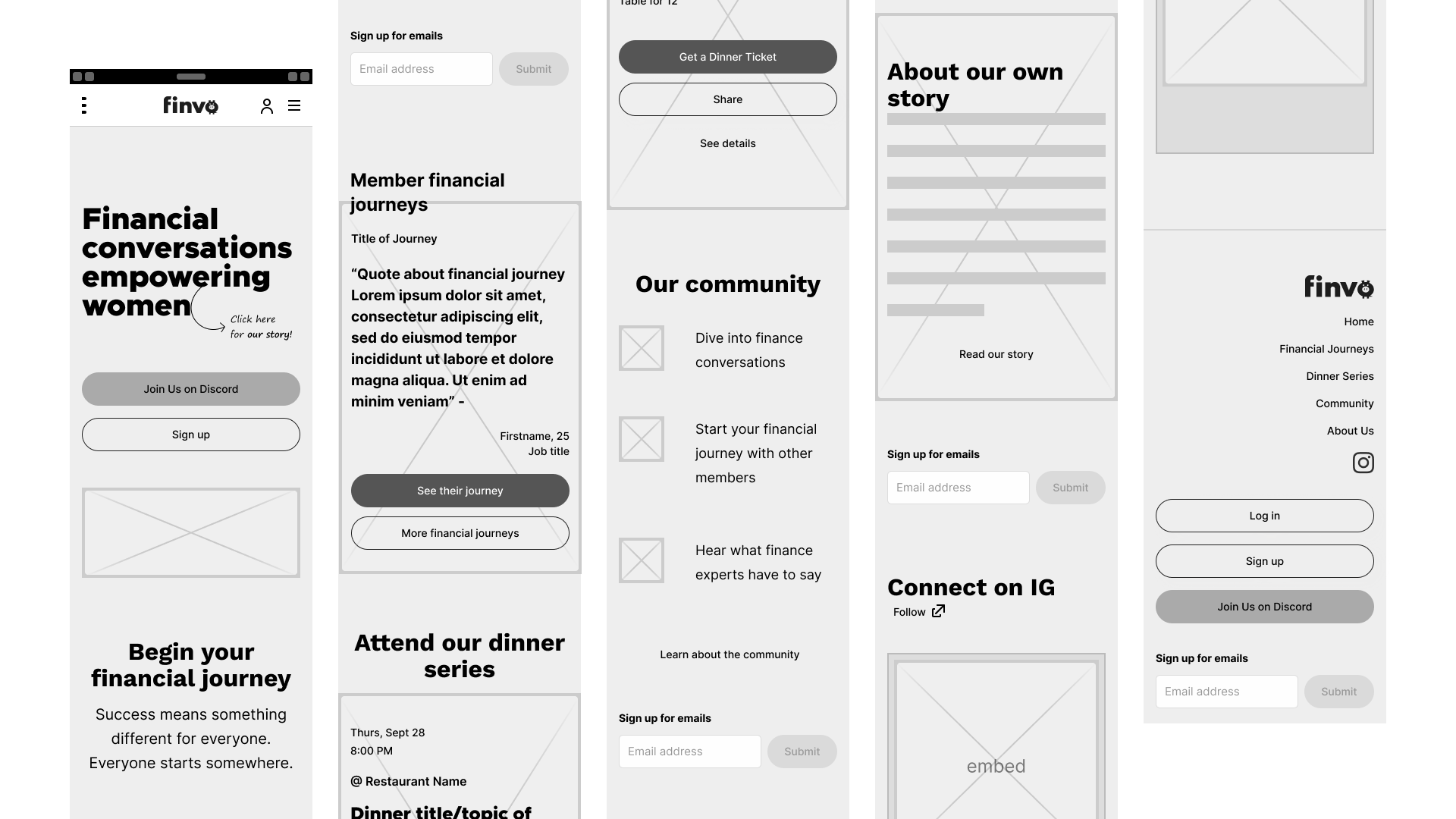
    Wireframes

    Homepage wireframe

    Usability test

    Testing with a user showed that the website had too much on it and was not focused enough. So we reduced the website objectives to the top 3 of joining discord, telling about Finvo's story, and showcasing an in-person event.

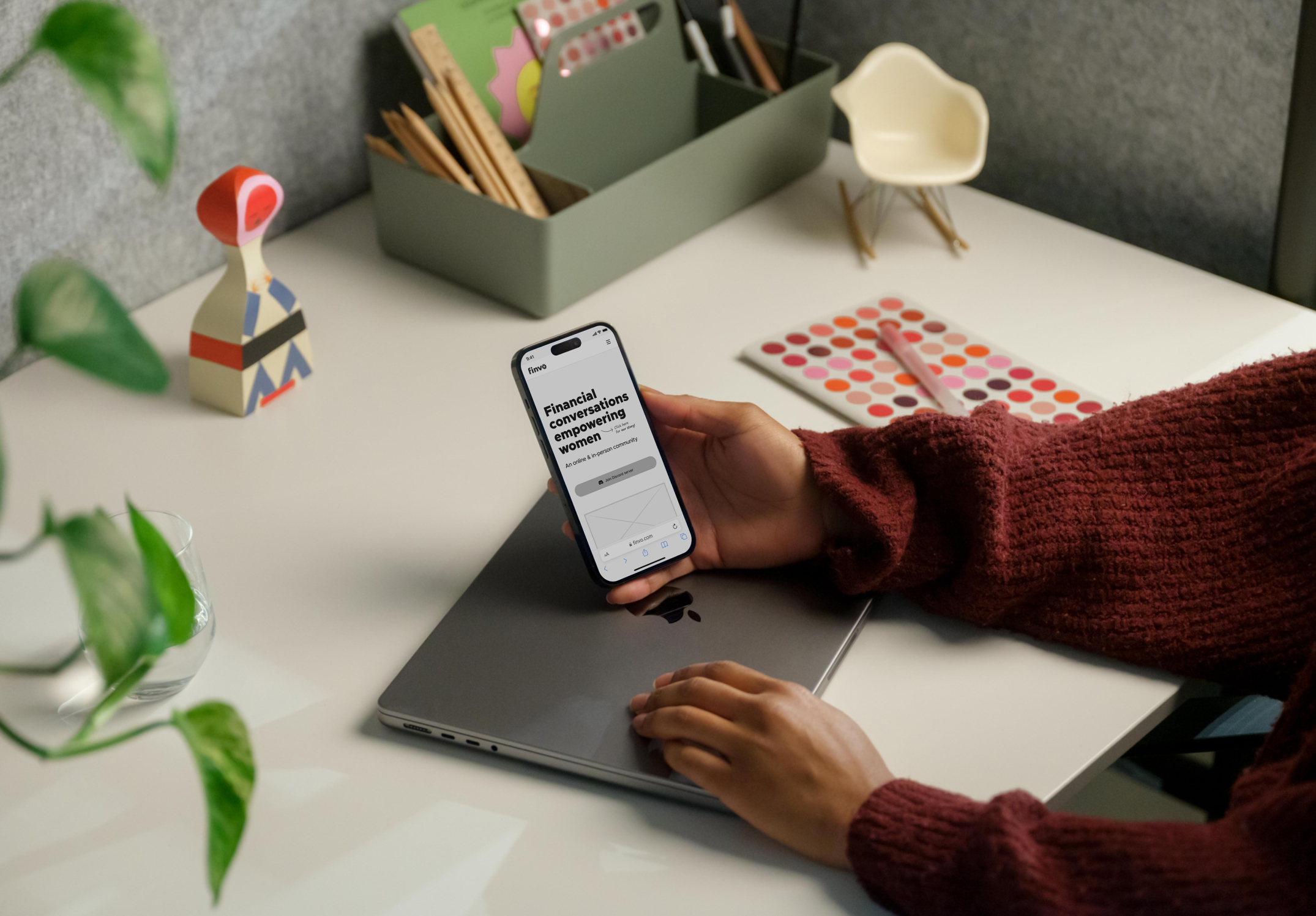
    Finvo prototype: Event sign-up and payment flow (better viewed on desktop)
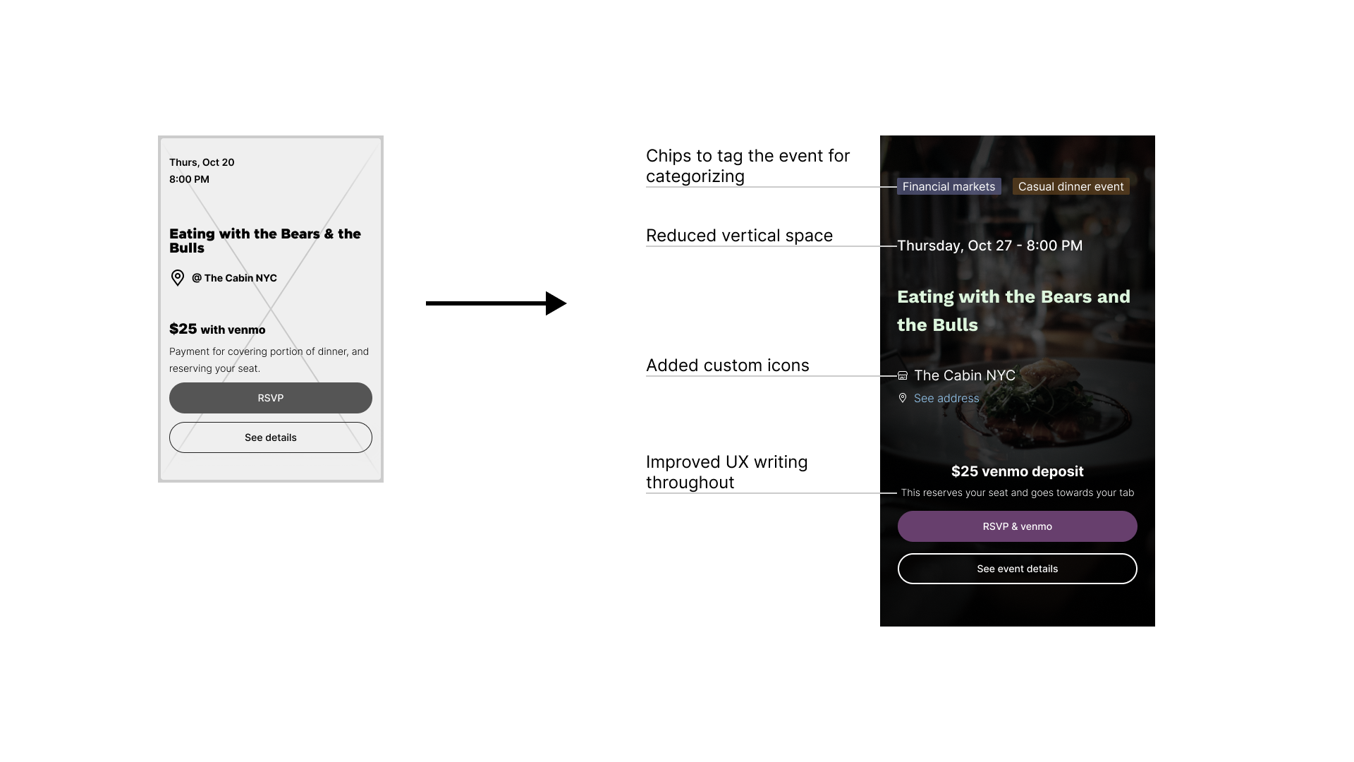
    Event card

    In-person events are vital to the Finvo community. Having a card that provides enough information with good visual hierarchy, conveys the necessary details to users and persuades members and non-members alike to participate.

    When our initial wireframe was shown to a user for testing, they were not sure if they were looking at an event so we decided to add chips to categorize events.
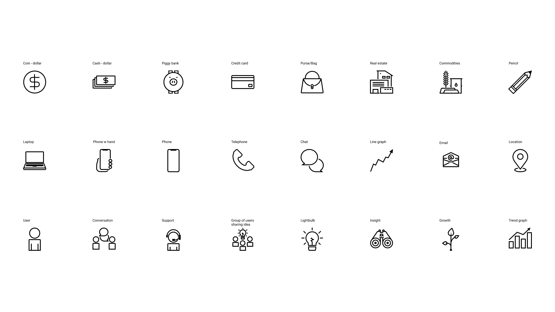
    Event card wireframe and hi-fidelity mockup annotations

    Iconography

    Some custom icons created for Finvo.

    Large 80px icons relating to finance and community

    Though I ran into trouble using PHP for the form sign-up flows, I had fun working on code for the site that would be able to help a developer in implementation.

    With busy lives, the Founders of the community have currently paused their activity and work has been held off for the time being.

  • First Derm

    Product design

    Overview

    For 4 weeks I worked on this project as an individual contributor and reported to a lead designer. First Derm is an early-stage telehealth dermatology startup.

    First Derm app prototype on a mobile device

    Challenge

    The Founder wanted to reduce the friction in their submit case flow.

    Initial research

    Research and usability testing surfaced the points in the following table. We decided to focus on the case details & photo-taking flow and payment flow that causes uncertainty in the overall case details flow.

    Challenges and Objectives table

    Low-fidelity mockup

    Annotated lofi screens

    We validated our lofi designs with more usability testing, and moved on to create the hifi mockups.

    Case details: Change from original screens to new Hi-fidelity mockups

    Changes in case details screens

    Payment: Change from original screens to new Hi-fidelity mockups

    Changes in payment screens

    Due to time constraints, we could not solve all of the pain points that we found in our usability tests.

  • Cortland Harvest

    Visual design

    This project consists of creating a visual identity for a local produce and agriculture initiative that promotes buying local foods as well as supporting agritourism.

    Cortland Harvest logos throughout a dinner prep

    Challenge

    The organization wanted an illustrative minimalist logo that appealed to millennials and could look good as a sticker somewhere like on a reusable water bottle.

    Standard logo

    Standard primary brand color logo

    Horizontal lockup logo

    Horizontal primary brand color lockup logo

    Logo ideation

    Taking Cortland County's prominent characteristics of rolling hills and seven valleys, I came up with a few logo ideas.

    Logo ideas

    The final logo fulfilled the organization's requirements of being minimal enough, looking good as a sticker, and being fit to appear on produce.

    Simplified logo

    Simplified primary brand color logo

    I had a harder time creating the color palette. Initially the palette had the same hues but was more washed. With the help of the team, the resulting color palette was vibrant, representing a ripe produce feel that better represented the brand.

    Brand guidelines color palette page

    Color palette page of brand guidelines
  • Cortland Food Project

    Visual design

    The work here's a visual identity for a multi-disciplinary food projects group . The group promotes agricultural economic opportunities, sustainability, and nutrition for all.

    Cortland Food Project's logo on a food container

    Challenge

    The group wanted a mark that was approachable enough to be both consumer-facing and industry-facing, while also representing the diverse initiatives the group does work in.

    Main logo

    Main primary brand color logo

    Alternate logo

    Alternate primary brand color logo

    Logo ideation

    After discussing some different concepts, the logotype form was deemed to be most applicable. With the removed o's, many ideas can be represented. Other logo ideas revolved around food, community, and produce.

    Logo ideas

    The final logo has marks representing different ideas such as togetherness, growth, nutrition, and energy. The group was satisfied having it as a consumer and industry-facing mark.

    Main logo in black

    Main black logo

    The clients wanted the produce that represented o's in food to have two tones in their bodies for a more balanced and uniform look and feel. Finding the right shapes had the most uncertainties. In the end, the lines curved innocuously along the shape of fruits/vegetables and fit well.

    Brand guidelines color palette page

    Color palette page of brand guidelines